Redesigning the WebMD Symptom Checker
The WebMD Symptom Checker is a tool that allows symptoms to be entered via a body image map and recommends potential conditions based on those symptoms. The tool had a reputation for giving broad, unreliable results and was not mobile-friendly.
As head of the UX team, I worked with the product manager and other stakeholders to understand the business goals and guided my team through usability testing, ideation, wireframing, and UI designs.
Business Goals
Improve accuracy of results
Allow users to enter multiple symptoms and details about their symptoms
Clarify likelihood of suggested conditions
Design a responsive layout to support users on multiple devices
Improve overall user experience
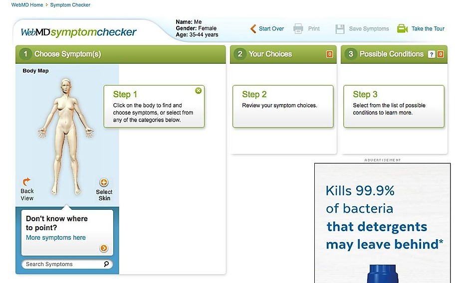
Original Desktop Symptom Checker Tool
Outcome
The final solutions was a responsive, modern design with a progressive navigation flow and simplified symptom entry process that reduced drop-off rate, increased engagement, and improved the accuracy of condition suggestions.


THE PROCESS
Generative Usability Testing
We conducted two usability studies to assess the usability of the existing Symptom Checker tool, one on desktop and one on mobile. The majority of WebMD users are women aged 25 - 54 so we recruited 6 participants based on these demographics and screened for those who were currently experiencing one or more symptoms.
Findings
The most surprising discovery was that the 20 year old iconic body map was hard to use which directly related to its reputation for inaccurate results.
MAJOR ISSUE: A majority of participants had difficulty using the body map to find symptoms
6/6 on desktop
4/6 on mobile
MEDIUM ISSUE: About half of all participants struggled to add a second symptom
4/6 on desktop
3/6 on mobile
“It was fairly difficult to move between body parts. I had to go back and forth a lot, which felt pretty tedious”
“would be easier if I could just type in [my symptoms]”
User RESEARCH
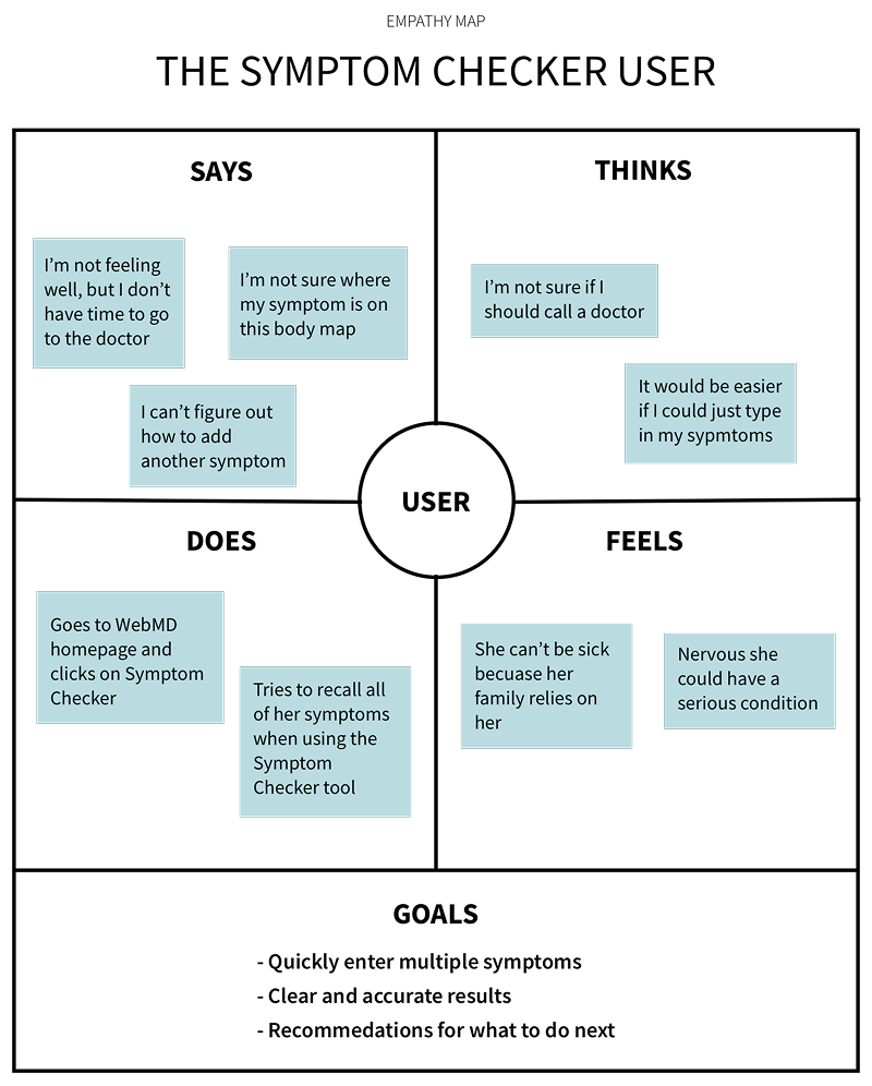
People feel stress when experiencing unknown health issues and want quick answers to help them make treatment decisions.
When people are stressed about their health, they didn’t always remember their symptoms.
People are not always aware of where their symptoms originate in their body.
Answering specific questions about their symptoms gives people more confidence in the accuracy of suggested conditions.
With the business goals, insights from research, and usability issues in mind we created a problem statement.
PROBLEM STATEMENT
Symptom Checker users feel anxious and need the ability to quickly enter multiple symptoms and clearly understand their results to feel confident when deciding on a treatment.
IDEATION AND DESIGN
I facilitated an ideation workshop with the team to sketch out possible solutions based on our problem statement.
With the user goals from the empathy map, the issues we uncovered during usability testing, and business goals in mind, we used the crazy eights activity to quickly sketch out possible solutions.

HOW MIGHT WE…
support quick entry and Selection of multiple symptoms
Possible Solutions
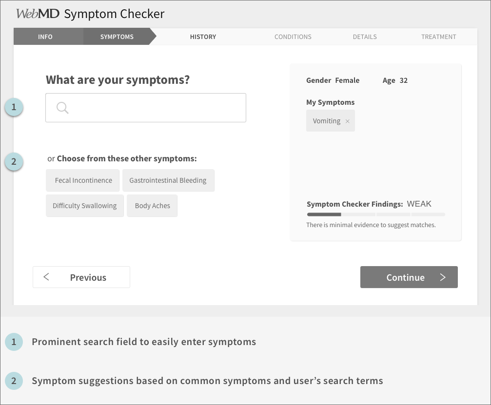
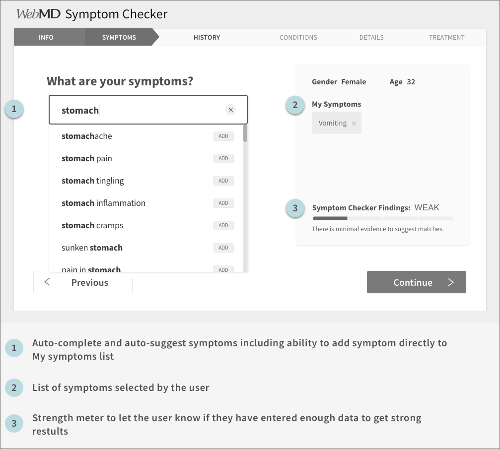
Replace body map with prominent search field.
Include auto-complete and auto-suggest functionality in search field.
Allow selection of symptoms directly from auto-suggest list.
Display related symptom suggestions below search field.
clearly communicate likelihood and accuracy of condition results
Possible Solutions
Create a Findings Strength Meter on search page to visually indicate the possible strength of the results.
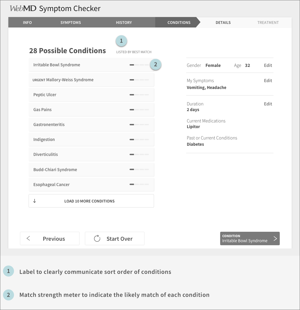
Clearly communicate sort order of conditions by best match to your symptoms.
Include condition match strength meter on the results list to indicate the match strength of each condition.
Wireframes
The team went to work turning these ideas into mid-fidelity wireframes and prototypes in order to communicate our ideas to stakeholders and test with users.
Evaluative Usability Testing
We conducted another round of usability testing to assess the effectiveness of our proposed solution. We recruited 6 female participants ages 30-60 with at least one health issue.
The findings:
6/6 participants immediately found and entered their symptoms
6/6 participants understood how to enter the second symptom
6/6 participants used the word “easy” or similar (e.g. user-friendly, intuitive) when describing their overall experience
4/6 participants did not understand the match strength indicator on the condition results page
“I like how easy it was to put in my main symptom and it automatically gave me a list of similar or related symptoms.”
“I liked that it seemed to follow my thought process”
ITERATION AND DELIVERY
The team continued to iterate and test the designs from mid-fidelity through hi-fidelity mock-ups in conjunction with the UI designer. By the end of the project we had run 7 usability tests with a total of 58 participants, and 38 tasks with a final task success rate of 100%.


